TIANHANG (SKY SOLUTIONS)
Responsive Website & mobile app design for enterprise-facing travel management company (2015 -2016)
Objectives
Background
This project is for a Chinese tech company TianHang (Sky Solutions), an enterprise-facing airfare and travel management website for booking flight tickets, hotels, and other travel services.
There are three parts of this project: UX Research, Website Design, and Mobile Application Design
Build the first online digital platform for TianHang’s business, including a marketplace and management platform for their enterprise clients.
Make a successful transition of the business to the digital age.
Build products that fit their new business model, from B2B to B2B2C.
My Contribution
Scope
UX Design- UX research, brand/visual strategy, persona and user journey, information architecture, user access hierarchy, set map and wireframe.
UI Design- Desktop website: un-log-in “Home” page, B-End "My profile" page and "Join Us" page;
Mobile application - “profile data management” pages, “travel info” pages, “promotion products” pages and “flight check-in” pages.
Tool- Adobe Creative Cloud, Sketch, Principle, Keynote
Web UX research - 4 weeks
Web UX design - 4 weeks
Web UI - design - 6 weeks
Mobile App UX research - 2 weeks
Mobile App UX Design - 4 weeks
Mobile App UI Design - 4 weeks
Design handoff with develop team - 8 weeks
New products for new business - from B2B to B2B2C.
Challenges
TianHang was a B2B business model. In China before the advent of online airfare services were popular, thousands of airfare agents existed.
People had to go to the agents' office to buy airfare and pay for their bookings in cash at the office.
Tianhang was selling airfare to those agents. However, because of the popularity and convenience the Internet, almost everyone began purchasing tickets online, and travel agents became obsolete.
Problems
The structure of the original website is very complex with many scatter type interaction and the use of pages is not efficient. It lack of cross interaction and full of useless repeated information pages.
There are no "recycle paths" for navigating through web pages, of which there were too many. The site is like a maze.
There is no "core flow" for the website, which creates difficulty when browsing. Lack of visual consistency andupsells for major products (only one page mentioned it).
Requirements from the PM
We have meetings with Tianhang marketing department, product department, technical department and the board every week.
We will discuses about the detail of their product definitions, content requirements, UX and UI expectations and technical problems of this product and how we process those information and achieve the goal though our design.
This communication is the key that make all the team to speak the same language and deliver the best works.
(The detailed requirements are in the chart.)
Solutions
We created different task flows based on different user types. For individual members, the main focus was on:
Support searching & browsing flights without logging in
Simplify and streamline flight booking experience
Encourage users to purchase Tianhang's membership
Tianhang allows local flight agencies to book flights for their clients. Additionally, it gives agencies to check their income and benefits through:
Flight booking; flight insurance; hotel booking; other add-on services (airport taxi, shuttle, etc.)
The hierarchy and access of different user accounts
TianHang decided to open their market to individuals. Therefore, they wanted us to create two different types of accounts, a B-End (for business users) and a C-End (for individual users). The two different account types would show information (airfare price, upsells, account info) differently. One of my concerns was how to make a reasonable and efficient design for two different accounts. Also, the backend engineers had to build them in a short amount of time (three months).Following is our proposal for the relationship with the different type of accounts.
How we make it better
Based on the material from the marketing department and the research we had. We build this site map for our new website to minimizing the user flows for major assignments. I cleaned up 5 major feature lines for all the accounts. As we can see in the new site map below that most of the pages and features of B-End membership, C-End membership, and new users are overlays for their common needs; such as airfare searching and purchase, promote products and customer serves. For the different service that we proved for the different type of membership, we have authority for the website to show or hide the information to then. In this way, the information that shows to our user is more efficiently and optimized, and the experience of using our serves whatever is purchasing airfares or manage their sale reports are much more easy and clear
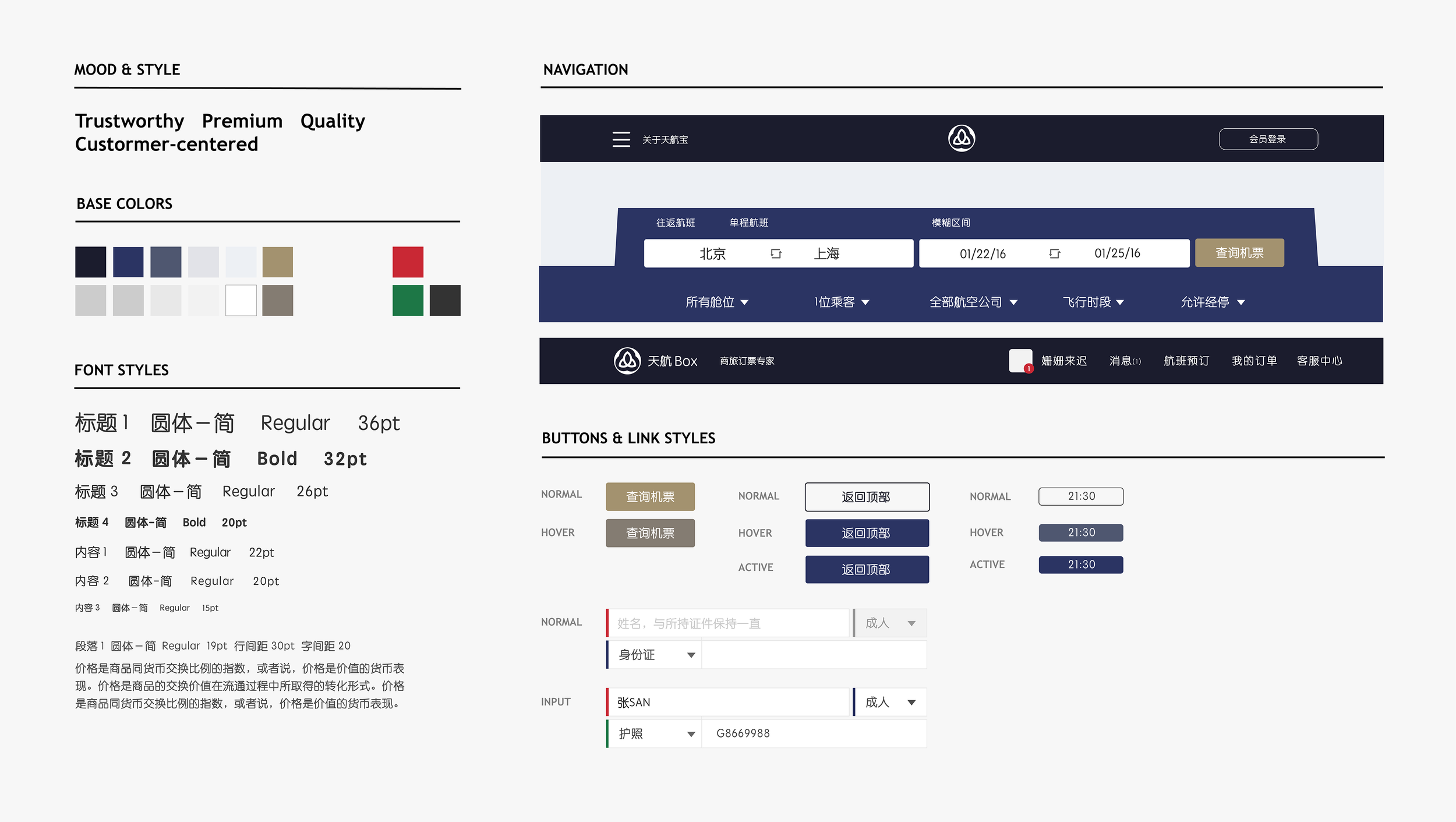
Visual styles
Wireframe to interface
MOBILE APP DESIGN
Design team: Wendy Di Wang, Cynthia Mao, Shan Shen, Chloe, Chufang, Lvxing, Ricky.
Text Credit : Cynthia Mao
Image Credit: Shen Shan


